Friday 30 January 2009

Susan Rothenberg
The Italian Pavilion at the Venice Biennale
31 August 2007

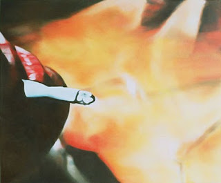
The Fence 4 (chicken wire) 2006-7
Oil on Canvas 71 x 71 cm

Frankly I was very disappointed with most of the painting on show this year in the Italian Pavilion. However, I did find the group of five paintings by Susan Rothenberg interesting, representing a major shift in direction since I had last seen her work.

After making her name with iconic paintings of horses in the 1970’s and 80’s she moved to New Mexico and broadened her subject matter to encompass the landscape around her and her working environment. Part of this transition has been the gradual appearance of figures within the paintings and the introduction of narrative. This grouping of five paintings could almost be telling the story of erecting a fence on the ranch she shares with husband Bruce Nauman.


The painting I have chosen is the smallest of the group and the only one without coloured elements. Taken in isolation it acquires a totally different mood to the rural scenes depicted in the others with their horses and dogs cavorting about as the male figure sets about repairing the fence. True the subject could be repairing the fence, but the framing of the action results in ambiguity and instead of the face showing despair about the task in hand, the emotion can be read as trapped resignation. One can only guess at the intention of the artist but the image certainly encourages a melancholic reading.

Susan Rothenberg The Fence 2 (Holding), 2007 oil on canvas 167 x 225 cmThis melancholic aura is accentuated both by the muted palette and her loose gestural brushwork. She doesn’t paint from life, nor does she work from sketches, instead painting directly onto the canvas with dilute paint. She then starts building up the surface, making corrections and alterations, and leaving some of the original drawing showing[1]. Although this painting is perhaps not a good example of that incremental process of statement, revision, cancellation, and restatement, I think it is in evidence and also reinforces the latent sadness in the image.


This painting from the series (The Fence 2 Holding, 2007) shows her technique more clearly, but the mood for me is one of puzzlement rather than melancholic.

[1] Wright, Karen, Interview with Susan Rothenberg, Modern Painter Autumn 2003 p60

©blackdog 2009

Thursday 29 January 2009

Dana Schultz
Royal Academy, London
10th October 2006

Face Eater, 2004
Oil on Canvas 46 x 58 cm

Went to the USA Today exhibition of works from Saatchi’s collection at the Royal Academy. One of the highlights for me was going to be seeing Dana Schultz’s paintings for the first time. However, I have to admit to being disappointed, I think they actually look better in reproduction than in reality!

The best of those shown was Face Eater, a truly gruesome piece of self-cannibalism which like all her work is from her imagination, not a photographic source. It is from a series she did of Self-Eaters between 2003 and 2004. The subjects are member of an imaginary species of cannibals, able to consume their own bodies and regenerate themselves endlessly. It is possible to see the idea as analogous with painting itself, eating up past imagery and making something new from the pieces.


The format is that of a classic portrait, with the head central and close, but not touching the edges of the canvas. The eyes are looking at the viewer just before they are devoured by the gaping mouth. The background is dark and this saturnine gloom provides a strong contrast with the flesh tones and lime green shirt. Some blobs of blood and flesh drip from the maw as the tongue lolls out. Flesh tones not as lurid as some of her work, her usual taste is for hot purples and pinks.

The strong blocky brushstrokes remind me of the ‘facets’ and planes of colour in the work of Paul Cézanne, but I don’t think the cubist references are the point. I think her influences are closer to Georg Grosz and Otto Dix in this series, and perhaps Paul Gauguin and Henri Matisse in her earlier series on Frank (the last man on Earth).

Her paint is surprisingly thick, opaque and built up in relief, enhancing direction and weight. The edges are blended on the canvas by painting adjacent strokes wet next to wet.

It is interesting that although her ideas are deinitely melancholic, the images themselves don't seem to reinforce this, leaning more towards the tropes of horror movies than those of melancholia. In fact, the most disconcerting aspect of her work (apart from the subjects) is the often confusing perspective and the way the surface flips between 2d and 3d.

©blackdog 2009

Wednesday 28 January 2009

Pierre Bonnard
The Tate Gallery, London
April 1998

Nude in the Bath and Small Dog, 1941-6
Oil on canvas 122 x 151 cm

I was tempted to choose Indolence, a nude from 1898 that has a definite feel of ennui. However, I chose this late painting of his wife Marthe entombed in the bath at their home Le Bosquet. She died in 1942, aged 75.

I find it a very melancholic work and the sense of loss he felt, is heightened by the fact that even in her sixties he is still painting Marthe as the young woman he had met aged 16. We see her, unobserved from above and behind her shoulder. The small dog on a mat gazes out of the painting at the viewer and symbolising fidelity even after she is gone.


Bonnard delighted in observing Marthe without being seen and drew her constantly. There are dozens of drawings in his sketchbooks and diaries of Marthe in the bathtub. The subject is fairly central in both planes. Perspective is indicative of space rather than an accurate portrayal and gives a certain dream like quality to the painting.


In this painting the dazzling array of colours, predominantly blue and gold make the bathroom shimmer with light. A collection of sweet wrappers (seen in photos of his studio by Brassai and Henri Cartier Bresson) served as the model for this light reflecting off the tiles[1].

The very diverse handling of the paint in this piece contributes to its interest for me. Some areas of the paint still look wet, a lot of medium enhances the transparency and contrasts with drier areas such as the curtain on the left. The brushwork is typically nervously dabbed and only makes sense from a distance. Close up it is just paint!

[1] Need a reference for this nugget!


©blackdog 2009

Monday 26 January 2009


Caspar David Friedrich
Not seen (Alte Nationalgalerie, Berlin)
13 January 2009

Der Mönch am Meer 1808-1810
Oil on Canvas 110 x 172 cm

Friedrich is classed as a German Romanticist and the title probably refers to the notion of artist as monk that was popular in Germany[1] in the early 19thC. Beat Wyss in her essay[2] on Caspar David Friedrich goes as far as to suggest that it is actually a self portrait of Friedrich wearing a black overcoat standing on the Baltic shoreline.


I need to arrange a trip to Berlin to see this painting as it is hard to gauge the aura of this painting from reproductions in books and magazines. What I do know from reproductions is that the painting shows a tiny figure of a man standing on the apex of a sandy coloured beach looking out over a dark oppressive ocean. There seems to be a storm gathering on the horizon. Apart from the triangle of sand and a few distant gulls there is nothing to suggest depth in the painting, and this lack of any reference underlines the loneliness of the figure contemplating the sublime natural landscape.

It is this notion of the sublime as a metaphor for infinity more than our insignificance in the face of the full force and terrible splendour of nature that I find melancholic. Friedrich seems to be asking us to stand with him and gaze at infinity (all the lines lead out of the canvas) and perhaps the boundless powers of artistic imagination.

[1] A favourite text amongst the German Romantics was Outpourings from the Heart of an Art-Loving Monk, published in 1797 by Wilhelm Wackenroder and Ludwig Tieck, tells of an artist, a pious wanderer who gives his all in his search for an ideal of beauty to which he swears eternal allegiance.

[2] Wyss, Beat “The Whispering Zeitgeist”, Tate Etc Issue 14 pp52-55


©blackdog 2009

Friday 23 January 2009

Muntean & Rosenblum
Interim Art, London
13th May 2003

Untitled (The day doesn’t promise …), 2003
Acrylic on Canvas 230 x 280 cm

My first visit to Maureen Paley’s gallery in the East end of London. An interesting exhibition by another ‘Tag Team’ of artists, this duo coming from Austria. Downstairs was a DVD video installation (To Die For..) and a large silver-point and charcoal cartoon in the Renaissance tradition. Upstairs there was a gallery with five large paintings. This was my pick of the paintings, a contemporary version of Manet’s Le Déjeuner Sur L’herbe. I liked the way it refers to the original without being slavish in the quotes it makes. I don’t think it is intended to carry a meaningful reference to Manet’s painting.

The painting floats in a white band with rounded corners that reminds me of seaside postcards. In place of the postcard caption, there is a piece of cod-philosophical text. Hence, the full title of the painting is Untitled (The day doesn't promise us more than the day, and we know it has a certain duration and an end. We would wait in vain for what we didn't know we were waiting for. And in the end there would be nothing but a slow falling of night). It makes a good epitaph for a generation for whom there is no glorious after-life to wait for and a new pair of ‘Converse’ trainers is as good as it is going to get.


When I first saw the works I presumed they used their own models (like they obviously do for the DVD) and photographed them. I have since learnt from Saatchi’s web site that they

“create their own Frankenstein models from the pages of trendy magazines (an arm from iD, a head from Vogue), they repaint their collages into scenes of freakish vacuity. Framing them as giant comic book excerpts (originally Muntean & Rosenblum published their paintings as comics), the underscoring texts lend a sense of nihilist dandyism, but are actually taken at random from trashy novels.”[1]

Paint is quite thin (acrylic remember) and the tones are distinct. Each band of tone made up of repetitive horizontal marks with a small brush, there is no blending. Technique reminds me of cartoon illustration with the figures in strong bright colours whilst the background is more muted and blurred..

I have now seen their work a few times and whilst I still think this is a powerful piece, I believe that their paintings fall into the same category as the lifestyle they comment on. The impact is quickly over and in that sense they have more in common with illustration than with painting. There is clearly a melancholic aspect to the ‘loss of culture’ that they portray and understand the need to reference ‘history painting’ but think their video pieces do it more successfully than cartoon paintings done on a monumental scale.

Recorded in my notes that the price was £23,000.00


©blackdog 2009

Thursday 22 January 2009


Paul Gauguin
Courtauld Institute Gallery, London
5 December 2008

Nevermore, O Tahiti 1897
Oil on Canvas 60 x 116 cm

It had been my original intention to include Gauguin’s painting from 1891 called Faaturuma which actually means melancholic. This is typical of his symbolist approach to colour and line and is indeed a melancholic full length portrait of Tehura, the 13 year old mistress Gauguin describes in his journal, Noa Noa, with her head in a pose reminiscent of Dürer’s Melencholia I. Unfortunately I have only seen reproductions of the painting, which is in Kansas City USA, I decided to use the equally sad Nevermore instead.


It is exhibited in the same room in The Courtauld Institute as Manet’s Un bar aux Folies Bergère and I could almost feel it brooding over my shoulder as I sat looking at the Manet. It is a half life sized reclining nude that loosely pays homage to Manet's Olympia which Gauguin was known to have copied before leaving France in 1895, on what was to be his last trip to Tahiti.


The canvas looks very coarse, perhaps jute or hessian, but had been primed so heavily that the weave is only visible in the corners. The paint is thin and the brush work light which gives a lovely luminance to the background. The nude figure is more opaquely painted and shows a degree of modelling, but not so much that it disrupts the overall lack of depth.


The composition sets up a triangular relationship between the nude figure, the watching raven and the two sinister figures deep in conversation in the background. The flash of the subject’s eyes somehow indicates that she is either listening in to their whispering or mindful of the watching raven. The pose with her head in her hand is borrowed from Dürer and is almost a symbol for melancholic brooding. Perhaps she is reflecting on the gossip of the women or the loss of Tahitian innocence (a favourite theme of Gauguin’s) in their paradise.

The title may be interpreted as an allusion to Edgar Allen Poe’s The Raven, which Gauguin new through a translation by his friend Stéphane Mallarmé. A sombre tone cerainly pervades the colours of the room in keeping with mood of the poem.


And the raven, never flitting, still is sitting, still is sitting
On the pallid bust of Pallas just above my chamber door;
And his eyes have all the seeming of a demon's that is dreaming,
And the lamp-light o'er him streaming throws his shadow on the floor;
And my soul from out that shadow that lies floating on the floor
Shall be lifted - nevermore!


Gauguin lightens this mood somewhat by using a bright, lemon yellow for the pillow, and touches of red behind her feet and legs. This strawberry red contrasts superbly with the greenish hues behind, just as the yellow does with the blue of the bedspread. Gauguin had very defined ideas about colour and although it is subdued in this painting, it still serves to convey meaning.


This sensitivity to colour could be criticised as decorative, but for me it always served to heighten emotions in his work and has been a big influence on my own practice.


©blackdog 2009

Wednesday 21 January 2009

Graham Crowley
Beaux Arts, London
21 February 2001

End of the Season, 2000
Oil on canvas 91 x 152cm

One of my first visits to a commercial gallery in London as a student and remember the atmosphere being fairly intimidating. Nice gallery, very frosty staff! Still, managed to hold my nerve and ask to look at the catalogue and survey the paintings for 20 minutes or so.

A series of large contemporary landscape paintings of scenes from around the west coast of Ireland done in two different styles.

The first type was done in a thick impasto style with thin glazes over the top and not to my taste at all. The second, and for me much more interesting, also used glazes, but was much flatter and had different colour glazes added wet into wet. This was an idea that was quite influential as my own style evolved, albeit used in a totally different way to Crowley. Despite the two style there was a unity about the exhibition and my predominate emotion was one of sadness. Looking back now I think the paintings are quite open, allowing room for one’s own interpretation – but at the time I was very conscious of the dabs of colour as “blots” on the landscape. Definitely not a “picture postcard” take on the landscape – more one of man’s intervention, but without resorting to photographic clichés.


I have picked The End of the Season, as the best representative of this luminously painted group. It depicts a campsite at the end of the summer season with just a few tents remaining and lots of pale patches of grass, where tents once were pitched. The bulk of the painting is in acidic yellows and greens, the latter depicting the trees and their shadows as well as the structure of the few scattered dwellings. These dwellings are embellished with flat patches of pastel colours, breaking up the uniformity of the surface. The overall impression is of a yellow sun going down on the right of the painting leaving long strong shadows. It is the end of the day at the end of the season.

I couldn’t say if he had worked from photographs or his own drawings, but the details, particularly of the trees are gestural and are more about painterly interpretation than realism. Strange decision to include the overhead telephone/power lines – perhaps just emphasising the connection with the world at large. We seem to have a point of view from the top of a telegraph pole. Depth in the painting is handled mainly by the scale of the trees, houses and tents.

Although I felt only sadness when I first encountered his work, I can now detect a sense of humour, particularly related to the brushwork. The catalogue tells me he draws inspiration from Constable, Morandi, Guston, Corot and Breughel amongst others and I can see how these artists have contributed to his language. Despite this, the predominately monochrome colour schemes and nostalgic references to times past within the landscape, transcend the rhetoric, reinforcing the melancholic character of the paintings for me.


©blackdog 2009

Tuesday 20 January 2009

Glenn Brown

Architecture and Morality, 2004
Oil on prepared wooden panel 140 x 98 cm

Serpentine Gallery, London
8th October 2004


This was a really influential show for me even though I had already seen his work before when he was nominated for the Turner Prize in 2000. It wasn't that the work was substantially different from that included in the Turner, but more that I had developed and matured as an artist and got a lot more from seeing the paintings. Having said the work was similar, the piece I have chosen was painted after the earlier exhibition and is a fine example of melanchoilc surrealism.

He is perhaps best known for his portraiture, and this is indeed a classic ‘head’ and shoulders portrait of a man, but in true surrealist fashion the head has been replaced with a bunch of chrysanthemums that are past their best. The title is from an album made by the “new romantic” synth band Orchestral Manoeuvres in the Dark in 1981 and through this association, a melancholic aura is projected onto the painting. Marcel Duchamp called the modern title an “invisible colour" and I agree with Alison Gingeras that Brown uses his titles as a way of wresting the appropriated work(s) to his own agenda[1].


This, as is most of his work, is appropriated from the work of others, but is not a direct copy. In this case the elements from two paintings, chrysanthemum heads from a Fantin Latour still life and a man’s body reworked from a portrait by Lucien Freud. Brown asserts that he has a vague idea at the outset and then searches through books and catalogues to find a painting that fits the idea. He works from the reproduction, possibly manipulating it with computer software.

He tends to use yet another, perhaps totally unrelated, painting as the source of the palette – in this case I don’t know that specific source. Green grey background. Whites with cold blues in the shirt, whites with faded yellows for the flowers, dark green and browns for the stems. Small flash of yellow on the sleeve of the shirt.

Essentially his work is a trompe l’oeil, in that he paints paint that has had the life sucked out of it through photography and reproduction and reinvigorates it so that it looks like it has depth and texture! His painting simulates rich impasto marks, but is in fact absolutely, totally flat. To achieve this he uses tiny sable hair brushes to apply swirling varying patches of colour in the desired colour scheme. Despite the flatness there is a unique character to his brushwork (does the colour and placement of these marks come from some kind of computer filter or does he draw them up beforehand?)

This idea of painting paint, could be linked to Roy Lichtenstein – automating production of the painterly gesture. According to Brown this erasure of the Expressionist gesture is linked to Gerhard Richter’s theory that painting and photography are now forever linked. Brown cites his early influences as David Salle, Julian Schnabel and Sigmar Polke but quickly moves on to express admiration of Picasso and Matisse for their use of colour, form and contradictory use of space.[2]

Glenn Brown studied at the same art college as myself and he has a retrospective coming up this year from 20th February until 10th May at Tate Liverpool .

[1] 'Glenn Brown', Gingeras, Alison M., Serpentine Gallery London 2004, pp19-20
[2] GB in interview with Rochelle Steiner 'Glenn Brown', Gingeras, Alison M., Serpentine Gallery London 2004, pp95

Monday 19 January 2009


Edouard Manet
Courtauld Institute Gallery, London
5th December 2008

Un bar aux Folies Bergère, 1882
Oil on canvas 96 x 130cm

Hung perhaps a little too high, the painting nevertheless commands the large room despite fierce competition from a number of paintings by Gauguin and Cezanne, and the best attempts of a huge gilt frame to bury it. It is a portrait of a young woman, Suzon, who worked at the Folies-Bergère, one of the great Parisian “cafés-concerts” and her central position on the canvas ensures that you see and assess her before anything else in the painting. She stands waiting to serve, behind a marble topped bar that is adorned with a variety of bottles and a large bowl of tangerines. As the viewer you are placed in the position of a customer at the bar, but you cannot catch her eye. The look on her face is distracted and she gazes past you with sad melancholic eyes.


I am quite surprised how controlled the mark making is, the surface is quite flat with just a few flurries of thicker paint for the highlights. I am guessing that it was painted quickly with few corrections. The lights on the blue jacket are done with white rather than by revealing a lighter layer below. The lights in the room shimmer in the mirror and the surface seems to vibrate with the delicate touches of colour on a predominantly grey surface. The oranges are the strongest note, but there is also red in the Grenadine bottles, the Bass labels, and green in a bottle of crème de menthe, two pale flowers, one lilac, one yellow, in a vase and the pinks in her cheeks and the columns reflected behind her head.

The axis of the painting seems to run right through her, starting with the ironing crease in her grey skirt, through the line of buttons on her jacket, to the corsage at her breast and finally to the locket around her neck and a symmetrical frontal view of her face. Perhaps her thoughts stray to the locket, maybe a token from a lost lover. She has her weight on one leg and supports herself with her hands on the bar. Clearly it’s been a long night. Gradually you realise that behind her is a large mirror and in fact she is the only person in the painting who is not a reflection. The reason why the reflection takes time to absorb is that the objects on the bar are not mirrored exactly, Manet has deliberately moved them. Furthermore there is a reflection of Suzon serving a customer that has been shifted to the right. Most of the literature (and there is a lot!) suggests that you are this customer, but I prefer the argument that Manet has painted a temporal disconnect[1] ie this is an earlier moment in time that lingers in the reflection.

The painting presents a world open to multiple readings and interpretations and the literature dwells on the notion of Manet’s modernism and the discontinuity between the two realms, the actual and the reflected. Is it perhaps a metaphor for desire and its impossibilities? Manet left no clues to his intention, but to me the painting speaks of the unbridgeable gulf between men and women, the rich and poor, mirror and window[2], and of course life and death. It was his last major painting and he probably knew he was dying, so after sitting with the painting for over an hour, I read it as his farewell to the Parisian life he had known and although his reflection lingers, the girl at the bar sees him no longer.


[1] How Manet's "A Bar at the Folies-Bergere" Is Constructed Author(s): Thierry de Duve and Brian Holmes Source: Critical Inquiry, Vol. 25, No. 1 (Autumn, 1998), pp. 136-168 Published by: The University of Chicago Press
[2] Windows control appearance through the framing edge, whereas mirrors are also self reflexive, in other words, we see ourselves in the representation.


©blackdog 2009

Saturday 17 January 2009

Eric Fischl
Not Seen (The Hirschhorn, Washington DC)
12 January 2009

The Funeral, A Band of Men (Two Women): Abandonment! 1980
Oil on Canvas 140 x 262 cm

This is perhaps an unusual painting to choose as it is one of his works that I haven’t seen in a gallery (acquired by The Hirschhorn in Washington DC and not currently on view). Although most of his best work has a fin de siècle melancholy, I chose this one primarily because of the clear relationship with the funeral procession paintings of Edouard Manet and Gustave Courbet.


Painted in 1980 and originally titled “A Funeral”, it is a scene pieced together from snapshots taken at his own mother’s funeral, who had died after a car accident in 1970. As the painting was completed ten years after the event, Fischl was not setting out to paint an impartial representation of a real event but one from his memory that will have been mediated through time and photography. In other words it is a painting about the recollection of a feeling at the funeral rather than the funeral itself.

In this grisaille, the family is gathered in mourning, all focused on the open grave with the exception of an adolescent boy staring out towards the viewer. He is in the foreground of the painting and looks very self conscious, embarrassed about being caught showing his feelings, a tear runs down his cheek.

The use of collaged photographs as source material is evident in the painting. The characters do look cut-out, yet the overall image works. I can believe the situation even though I know the painter was not at the funeral with oil, brushes and canvas. It is because the situation is one I can identify with – it is an observation of contemporary life that we have intruded upon as voyeurs. We are placed in the position of the original photographer, intruding in what should be a private moment. By collaging the ubiquitous snapshots taken to preserve the memory of the occasion, they have been manipulated by Fischl to comment upon the damage the camera can do to reality.

“I tried to make the painting take place at the moment the viewer comes upon a situation. You witness the awkwardness of that moment through the boy who’s looking out. He is caught between his awareness of you watching and whatever the emotions are that he is going through. That’s what it is all about – all of a sudden being more self-conscious, about being watched than about being able to express grief and bury the dead.” [1]

The expression of the boy is real, the camera caught it, but would he have had that expression if the camera had not been there and he had been allowed to grieve in private. Therefore, the reality in the painting is much more complex than that depicted by the 19thC realists. This is a reality where people behave according to examples set by the media, particularly by film and television, giving the painting the air of a split second taken from a movie, rather than a meticulous observation of a real event. The characters become actors rather than mourners in Fischl’s painting making it look like a painting of a film still rather than of a photograph of the funeral.


[1] Grimes, Nancy “Eric Fischl’s Naked Truths” Art News Sep1986 p76


©blackdog 2009


Blackdog Black & White Photography

Friday 16 January 2009


Giotto di Bondone
La Cappella degli Scrovegni
31 October 2005

The Arrest of Christ (Kiss of Judas) 1304-06
Fresco 200 x 185 cm

On the train journey from Venice to Padua the anticipation of seeing greatest single collection of frescoes in the world was building with every mile. Arriving at Padua station I immediately walked to the chapel to book the earliest ticket I could, to give me the maximum amount of time to see the paintings. Knowing that the timed tickets were at 30minute intervals I had naively expected to be able to stay as long as I liked.

The reality of modern art tourism was a shock. The 30 minutes was a fixed time, of which the first 15 minutes were spent in a dehumidifying chamber waiting for admission to the chapel itself. 15 minutes is an absurd amount of time to spend with so many paintings, I can spend a couple of hours over just one. The fastest art experience I have ever had in my life!


So, despite being well prepared, I found the visit overwhelming. To say that the chapel is stunning would be an understatement and it is hard to believe that it was completed in two years. I had taken my sketch book in but given the brief encounter with the paintings I had to concentrate on looking and forego notes let alone sketching. Yet being ushered out into the sun 15 minutes later I am not sure how much I had absorbed other than despite (or because of) the simple compositions and colour schemes, the spirit of each scene had stood out at a glance whilst maintaining a unity between the works.

Perhaps the most memorable of the individual frescoes was the one depicting the betrayal of Christ by Judas in the Garden of Gethsemane. The composition is thickly filled with figures, staves and lanterns and gives a good sense of the clash between the ‘followers’ and the soldiery. The figures of Christ and Judas stand out from the crowd and there is no mistaking what is happening. It is not filled with a wistful melancholy but the embrace of betrayal is met with an all-knowing expression of absolute forgiveness and the knowing what is to follow as the high priest orders the arrest of Christ.


Perhaps the most amazing feature of Giotto’s style is the variety of emotion and facial expression he achieves despite the simplicity of the faces. The comparison between Judas's sinister and animalistic kiss and the very private and intimate kiss from The Annunciation gives an indication of the level of subtlety he has mastered. Childless Joachim and Anna are meeting to share the knowledge of the impending birth that will change their lives forever. It is mouth to mouth and the eye contact is direct away from the main group inside the Golden Gate whereas in the betrayal kiss the faces are nose to nose and the group crowds around transfixed.

Perhaps that is his greatest quality; being able to make all the subjects individuals and yet a master of injecting feeling into the scenes whilst ensuring the ‘meaning’ isn’t diluted. I have since tried to emulate the amount of emotion which Giotto is capable of expressing by a single gesture, and can appreciate just how hard it is to avoid lapsing into caricature.

©blackdog 2009

Thursday 15 January 2009

Peter Doig
Tate Britain
01 May 2008

Blotter 1993
Oil on Canvas 249 x 199cm

The retrospective at Tate Brittain was one of the best I have seen for a contemporary artist and of particular interest to me as many works had a melancholic 'feel'. I have picked one of his earlier paintings, 'Blotter', that won the first prize in the 1993 John Moores exhibition and is owned by the Walker Art Gallery. The painting is behind glass with a large thick white wooden frame. None of the others in the room were framed and looked the better for it!

Peter Doig has said (Source: Walker Art Gallery Web Page) that “The title refers to (amongst other things) the notion of one's being absorbed into a place or landscape, and to the process through which the painting developed: soaking paint into the canvas.”

Could it also refer to the use of blotting paper as the medium for dosing LSD? Taking this hallucinatory drug can cause the user to experience radiant colour, make surfaces appear to ripple and can induce intense self-reflection.


The work was painted from a photograph (Walker Art Gallery Web Page), and shows the artist's brother standing on a frozen pond looking at his reflection. The figure is almost plum centre and wears a blue thermal padded jacket and a red headband.

Perhaps he is pumping water onto the ice by the pressure of his foot. He looks like he is absorbed in either his own reflection or this movement of the water under/on the ice caused by his weight. For me, it is this self-absorption or focus on his repetitive action that gives the image its melancholic feel. Probably because I can remember the feeling as a teenager, of being intensely engrossed in a small details in the landscape, rather than the splendour of the scenery. The relation of the figure size to the landscape gives a sense of isolation that is heightened by the choice of the portrait format making a towering enclosure of the trees.

The edge of the pool is on a 20 degree diagonal and the figure and the backdrop of the trees are reflected in the water. Concentric circles spread out from the tapping of his foot on the wet surface causing the water to ripple and pulse. It is interesting how the horizontals and verticals (trees) all lead the eye out of the canvas making this action the focus of attention.

The colours in the water are pastel lilacs with thin yellows, greys and whites. The colours are subtler than the photograph portrays. The path is a pale aquamarine, stippled with white. The trees behind are dark green and lilac green against a lilac ground. They are convincing as birch trees when seen from a distance. Behind the trees one can see a pale horizon line fringed with a dark silhouette of a distant tree line (blue under lilac) and pale sky above.

Most of the surface is layers of pale stains with areas bleached with spots of turpentine. Then the white (sometimes tinted) for the snow is brushed over the top. The trees are dark brown and then painted with black and green to give the birch bark effect. There are some large blobs of white and lots of smaller speckles to denote falling snow. The larger blobs are very thick and stand proud of the surface.

Despite these attempts at aerial perspective within the paint on the surface, the image reads as flat and one has to make quite an effort to discern depth. The result is that standing back we can ponder on the narrative, but up close we are reminded that it is just paint on canvas.

Wednesday 14 January 2009

Michael Fullerton
Tate Britain
7 August 2005

David Milligan 2004
Oil on Linen 90 x 70 cm

An interesting little exhibition, held in the ‘Art Now’ space in Tate Britain, mixing sculpture, video and painting. As far as I could make out the very loose common thread was communication or transmission of information. I have since discovered that he has also produced some small works in red pubic hair. One of which Hair of the First Girl I Ever Slept With, Tracey Emin picked for her curatorial debut as an academician and I saw at the 2008 RA Summer Exhibition. At least it made more sense in her “hang” than this collection seemed to. In all honesty I didn’t understand the relevance or point in showing so many disciplines in the same space.


I did like the paintings though - four portraits, all oil on linen. One was a portrait of John Peel - full length, but smaller than life size. Lots of small rapid brush marks letting the ground show through. The portrait I have chosen is of Glaswegian David Milligan - known amongst the artist’s community as the ‘dole spy’ for his undercover work for the Social Services[1].

The canvas is a modest size and struggled for attention with all the other clutter in this large room. I think the piece would have been even stronger if it had been life size. Not just because it would have held its own better, but because life size would have made the viewer/painting relationship more confrontational. This size is too easy to dismiss as a window onto another world.

The figure is posed slightly off centre and seems to be gazing over the viewer’s shoulder. He is slouched on one side with one hand resting in a trouser pocket the other leaning on a stairwell railing holding a cigarette. He is casually dressed in T shirt and jeans and has an expression of resigned boredom.

Fullerton uses an odd palette, coppery blues and greens, faded browns and reds. The paint actually looks like it has been applied and then sanded off again to leave white on tops of the canvas weave. Paint in any case is very thin. Paintings detailed but subdued by the lack of tonal variation (contrast). Presumably Fullerton works from photographs rather than drawings.

Obviously the pose contributes, communicating a depressing futility about his life and outlook, but I think it is his palette that gives this painting in particular its air of melancholy. It is almost as though his skin is made from creased brown paper bags. It says more to me about ennui than any of the stereotypical photographs of teen angst that were all the rage in the early 21stC.


[1] http://www.saatchi-gallery.co.uk/artists/artpages/michael_fullerton_david.htm


©blackdog 2009

Tuesday 13 January 2009

Lucian Freud
Tate Britain
4 July 2002

Two Japanese Wrestlers by a Sink 1983-7
Oil on Canvas 51 x 79 cm

I enjoyed the large retrospective of Freud’s work especially as it showed his development as a painter who did more than just fleshy nudes. Although many of his nudes do have a melancholic air, probably associated with the poor sitter spending many uncomfortable hours under very unforgiving light, I have chosen a small painting of the sink in his studio. The playful title leads the eye to the fragment of a small painting behind the taps, but the real subject is the water running into the sink which is depicted with astonishing realism.


The painting shared a room with a number of much larger pieces including one painting that shows the sink in the Holland Park studio setting, Large Interior, W11 (after Watteau) 1981-3. Yet for all the planning and careful references of the larger work I find it contrived and lacking the emotion of the small study of the sink.

I find it amazing that it is painted from life over 5 years, two years longer than Large Interior, especially as I struggle to develop a painting over 5 weeks and would prefer to finish it in 5 hours if possible. I trust the taps didn’t run the whole time!

Two Japanese Wrestlers by a Sink is of modest size and painted predominantly in whites and browns. Typically Freud avoids the emotional significance of saturated colour and this is no exception. The crop eliminating the front of the sink and the top of the second tap is very photographic yet given the painterly surface gives the image a surrealist feel. This sense of unease is further emphasised by the sink, taps, water and “wrestlers” all being left of centre. The running water guides the eye into the sink and we watch as it mixes with the residue of earlier paintings and runs down the drain. Freud is quoted as saying in the catalogue "Everything is autobiographical and everything is a portrait, even if it's a chair,"[1] and I cannot help but read this painting as a metaphor for his own life.

This reading seems totally plausible given the time spent he painting it, imagining the slow cycle of looking, mark making, looking again and making additions and corrections all accruing to give the finished piece its strong melancholic aura. It speaks volumes on the isolation and dedication associated with a lifetime working in his studio. Hopefully it isn’t just a pun on the genre of Kitchen Sink[2] paintings!

[1] Feaver, William “Lucian Freud” Tate 2002
[2] Paintings focusing on unglamorous and commonplace scenes of post-war austerity, and the drab existence of the 1950’s.


©blackdog 2009

Blackdog Black & White Photography

Monday 12 January 2009

Judith Eisler
Hayward Gallery
14 October 2007

Smoker (Cruel Story of Youth) 2003
Oil on Canvas 147 x 178 cm

Four of her works were exhibited as part of the excellent “The Painting of Modern Life” show at the Hayward Gallery. This was my first opportunity to see her work first hand. She works from film stills taken from the paused video or DVD of a film using this as the starting point for her paintings.

I am particularly interested in this type of appropriation (it is something I use myself) and welcomed the chance to compare her work with the paintings of Johannes Kahrs, who also works with film stills, which were conveniently hung in the same room. In the event I don’t think the location worked in her favour as the very strong Kahrs paintings dominated the space.

Unlike Kahrs she crops the original image down to a section or fragment to pick out a detail and generate a new emotion through her painting.

The painting I have chosen is taken from the Japanese film from 1960, Cruel Story of Youth and although I don’t have the precise film still she has worked from, it gives an idea of her working process.

In fact, the painting is so far removed from the original that unless you know the film and the narrative that it brings, you are able to project your own meaning onto the image. I found this painting the most melancholic of her work on show, an aura associated soley with the image as I wasn’t familiar with the filmic reference. The feeling I had was of isolation and solitude, which had everything to do with the title, the tight crop and the differential focus between the protagonist and the background. I did think of teenage withdrawal from society, but mistakenly thought it was a clip from a James Dean film.

The appearance of her paintings owes a lot to Gerhard Richter but I doubt if they are done in the same way. Her style is much more deliberate and although it appears abstract when viewed close up, it lacks the serendipity that I associate with Richter at his best. The paint is thin and the canvas weave shows, but the surface is too uniform for my taste. I suspect the unusual colour combinations and the strong contrast are connected with the process of photographing the television screen with a digital camera. The scale and aspect of the paintings bears no relation to either the projected cinematic image or a television screen. Nor does her painted surface (in this instance) allude to the flickering of a screen image in the way that Kahrs paintings do.

In conclusion it is not a style of painting that I will try and emulate, as I prefer to try and reference the projected film by keeping my paint very luminous, but the tightness of the crop and the differential focus is interesting and perhaps worth exploring further.


©blackdog 2009

Blackdog Black & White Photography